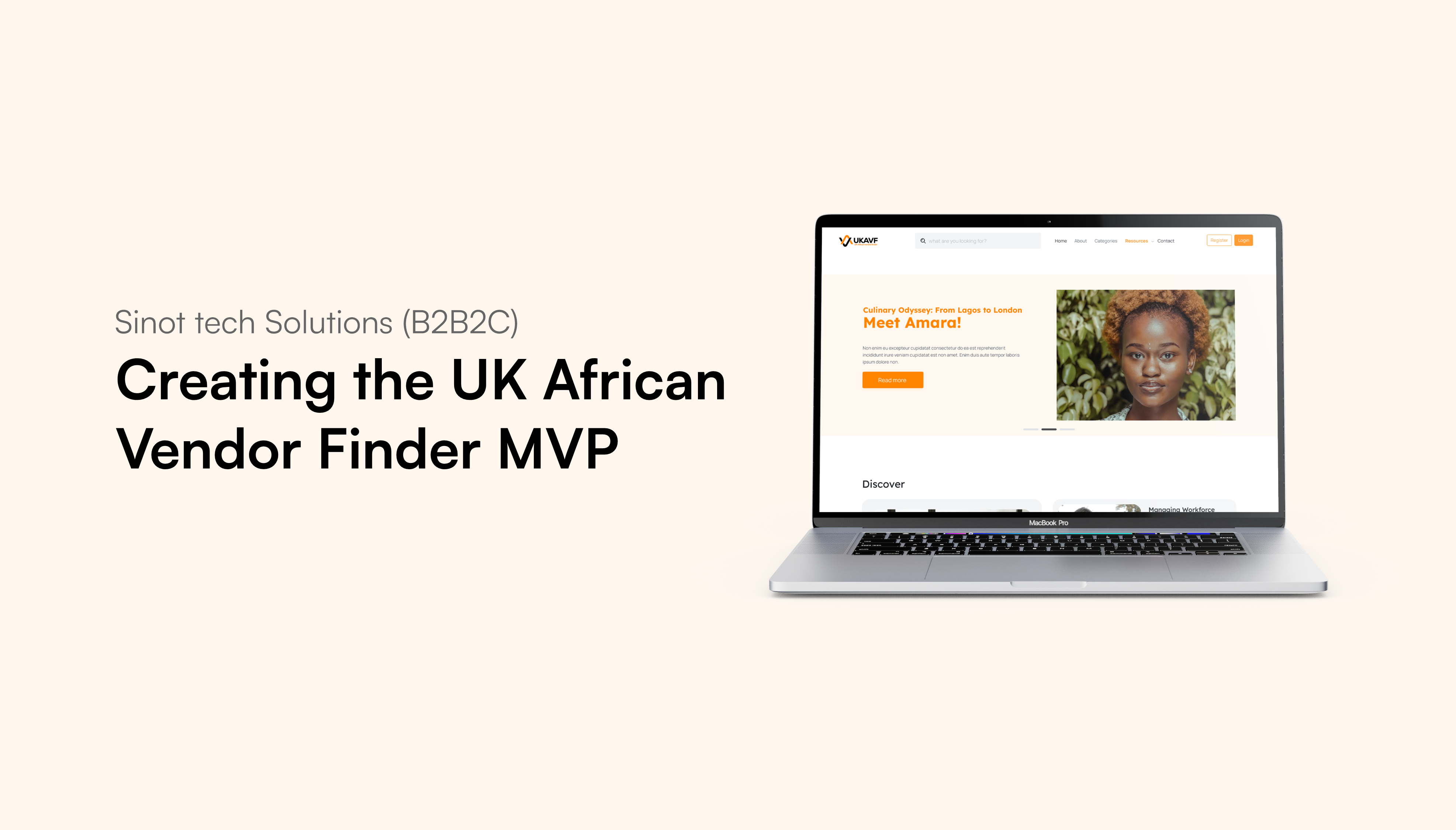
Bringing Visibility to African Vendors in the UK: Designing the UK African Vendor Finder Website

Despite the availability of various online platforms, African vendors in the UK struggled with visibility, onboarding complexities, and trust issues. The UK African Vendor Finder project sought to solve these challenges by creating a user-friendly, culturally resonant platform tailored to their unique needs.

The Client

Sinot Tech Solutions builds technology solutions for underserved markets. The UK African Vendor Finder platform connects African entrepreneurs with customers, enhancing visibility, trust, and community engagement while helping vendors grow their businesses.

My role

As a UX Designer and Product Manager, my responsibilities included:

  • MVP Collaboration: Worked closely with developers and stakeholders to successfully launch the UK Vendor Finder website MVP.
  • Actively participated in the scrum team, ensuring development aligned with user needs and business goals.
  • Led the design process, creating high-fidelity designs and providing strategic design direction.
  • Contributed to building user-friendly features, refining the overall user experience, and coordinating with developers for timely delivery.

Research Process

To ensure the success of the UK Vendor Finder website, comprehensive user research was conducted to deeply understand the needs, challenges, and behaviors of local vendors and users seeking their services. The research methods employed included:

  • Conducted interviews with 8 vendors and customers to understand their needs, pain points, and expectations.
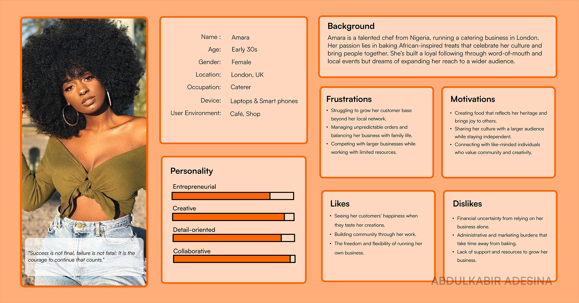
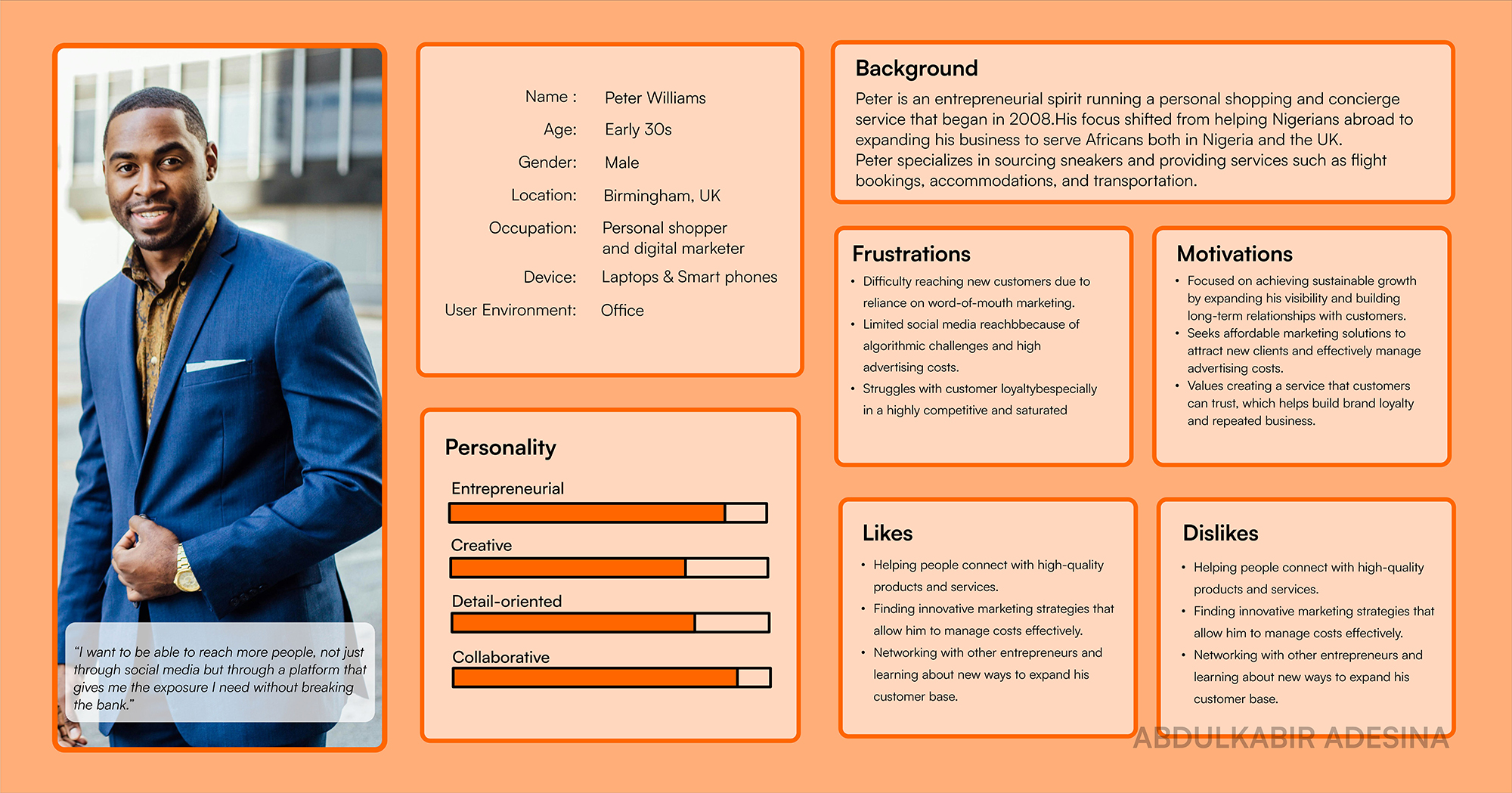
  • Created detailed personas representing key user types to guide design decisions and ensure the platform meets user needs.
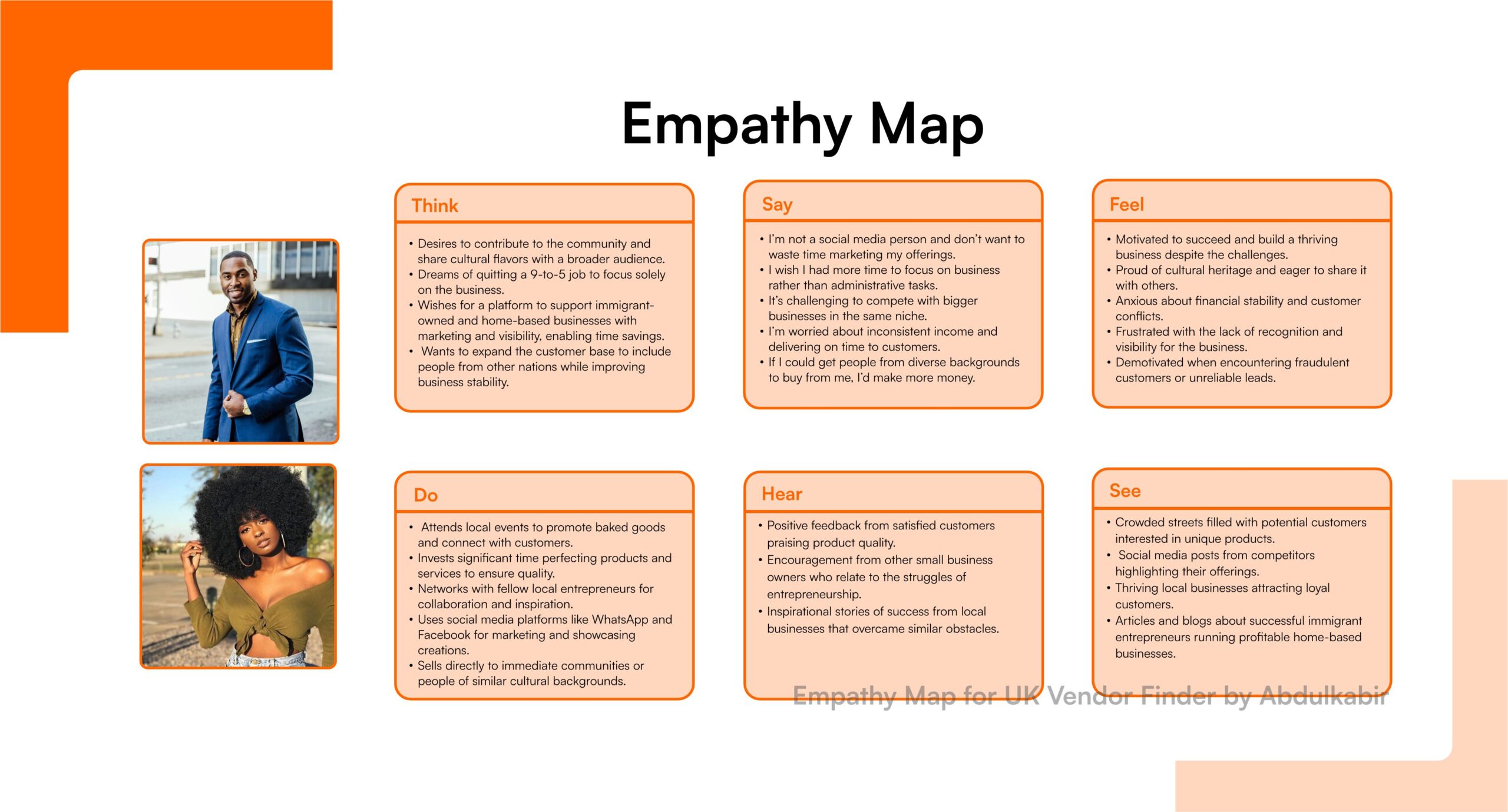
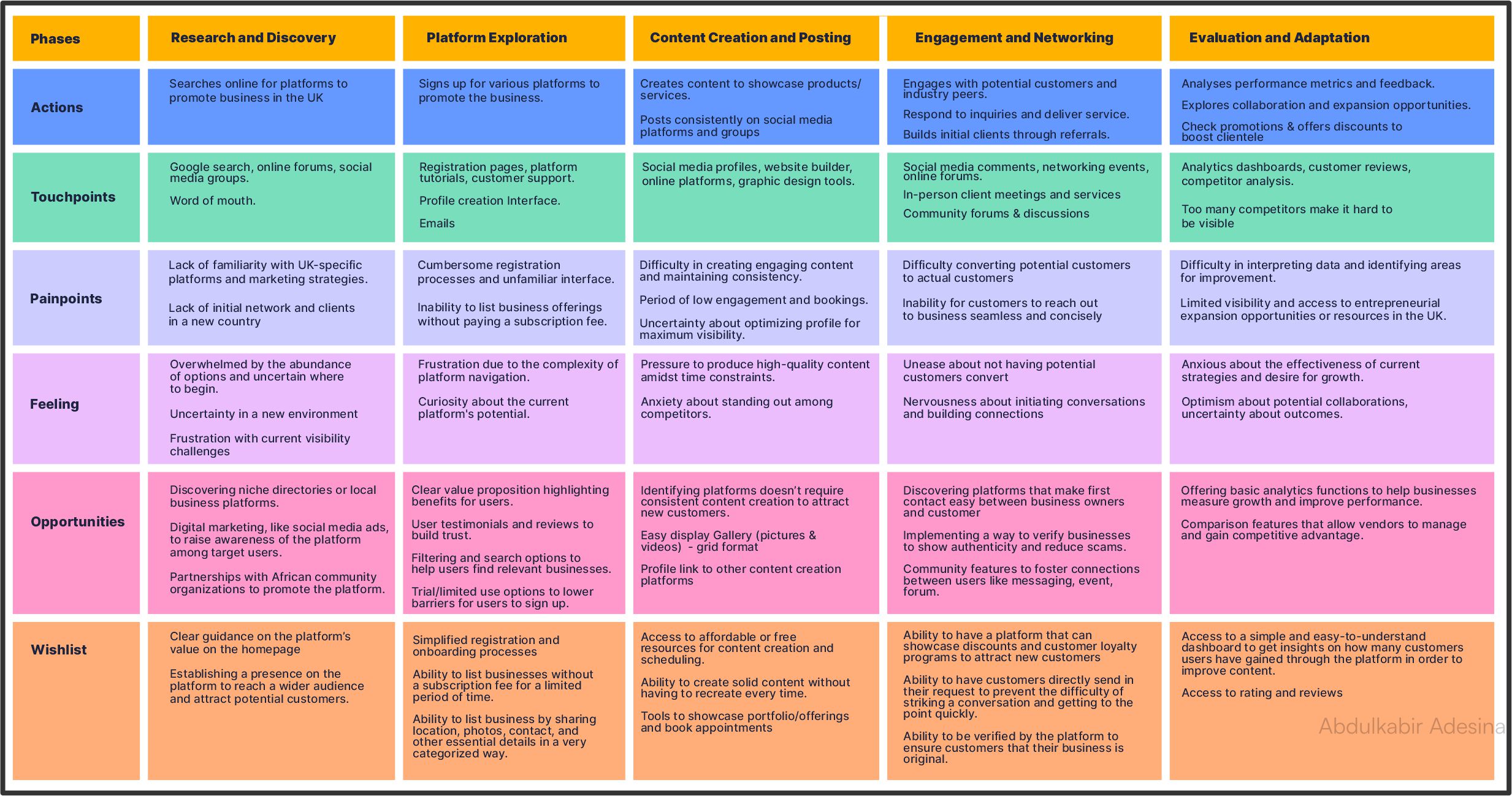
  • Employed empathy map to identify user frustrations and goals, highlighting areas for improvement such as navigation and communication.
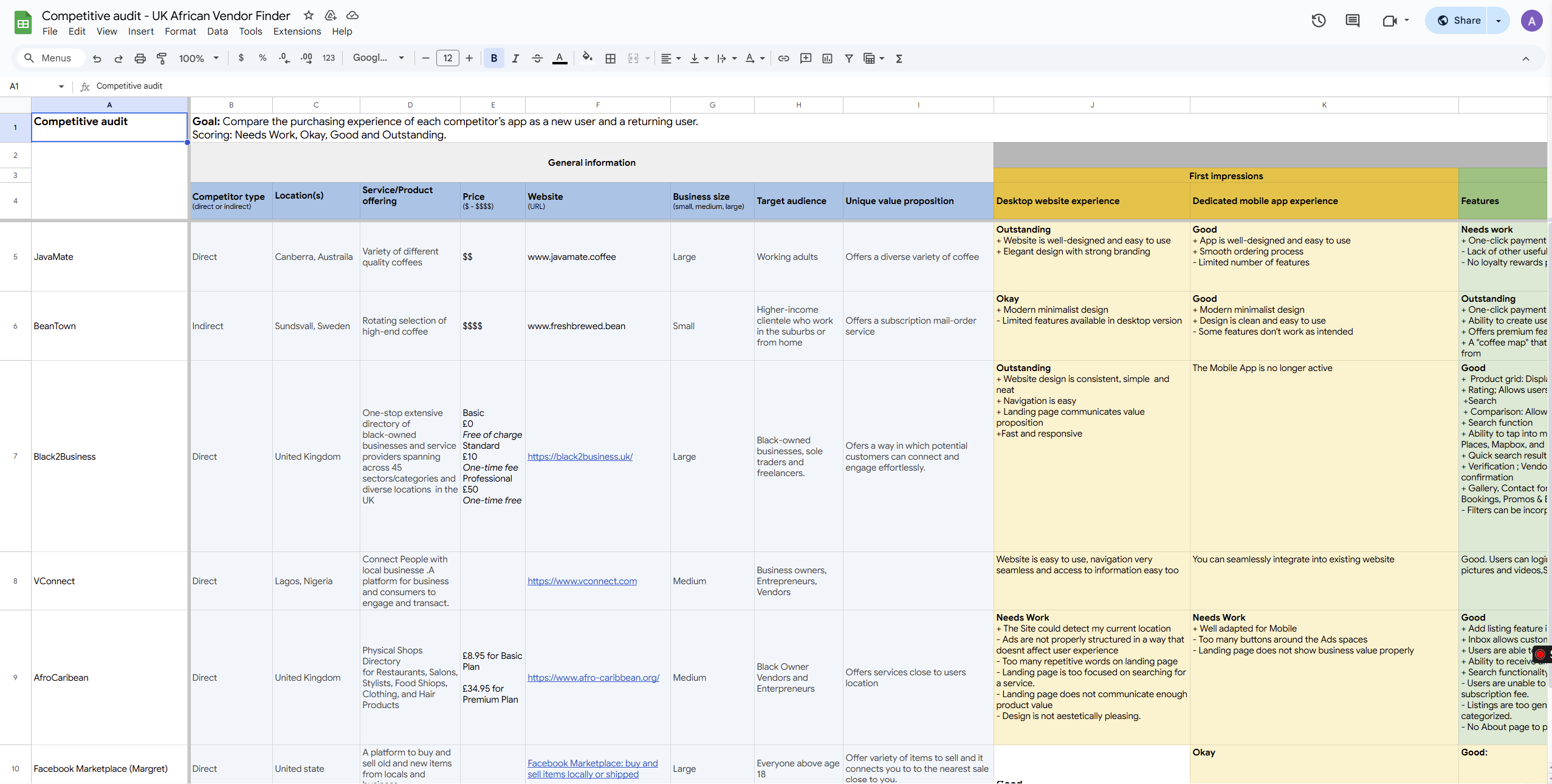
  • Evaluated market competitors to identify gaps like inadequate vendor profiles and lack of tailored services.
Persona 1 of 2: An entrepreneur running a personal shopping and concierge service.
Persona 2 of 2: Talented chef from Nigeria running a catering business.
Empathy map visual breakdown
Competitive analysis table/chart comparing features from brands in similar space.

User Journey Map

Visualized the end-to-end experience of vendors and customers to identify pain points, key interactions, and opportunities for a seamless platform experience.

Proposed Solution

To tackle the visibility and market access challenges African entrepreneurs face in the U.K., the African Vendor Finder U.K. platform will provide a centralized digital space to showcase their diverse services. This platform will:

  • Offer advanced search and filtering options, enabling users to effortlessly find vendors by category, location, price range, ratings, and operating hours.
  • Feature detailed vendor profiles with service descriptions, images, and customer reviews, allowing vendors to effectively highlight their unique offerings and build trust with potential clients.

Transforming Insights into Design

I translated user research into wireframes and high-fidelity designs, ensuring the platform addresses key pain points and enhances the user experience. This process involved creating Low-fidelity wireframes and high-fidelity designs

Low-Fidelity Designs

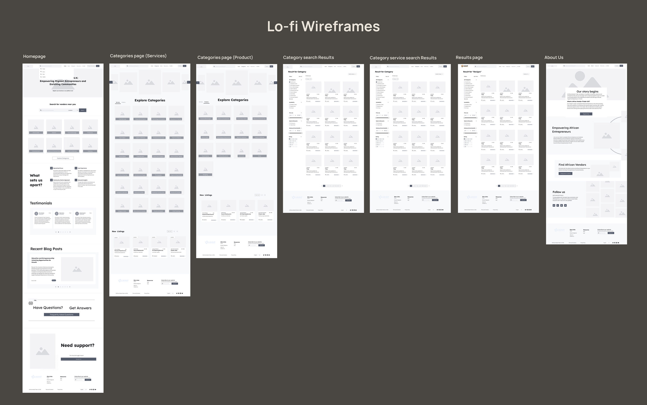
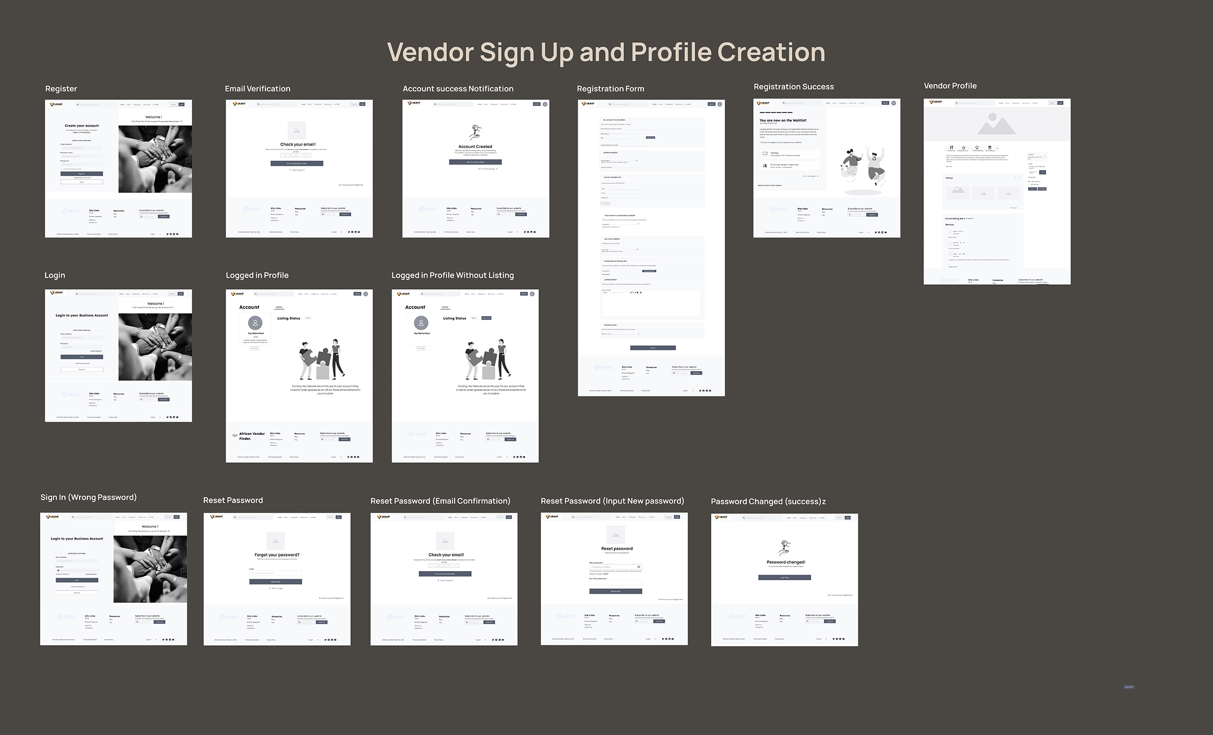
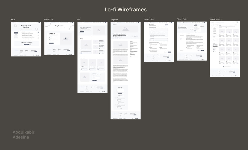
To bring the proposed solution to life, I created low-fidelity wireframes to map out the core structure, layout, and user interactions. These wireframes helped visualize and test key features and ensure a smooth user journey before moving into high-fidelity designs.

Wireframes showcasing key screens and flows

Key Insights & Changes

  • Vendor Stories as a Web Banner → Initially added to create an emotional connection, but stakeholders preferred keeping it in the blog for a cleaner layout.
  • “Meet Our Team” Section → Removed to streamline the design.
  • Brand Colors & Guidelines → Updated to align with the latest brand identity and stakeholder feedback.
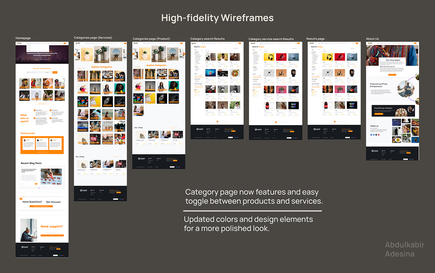
  • Category Page Tabs → Added a simple toggle to switch between products and services, making navigation easier.
  • Registration & Onboarding → Simplified to create a smoother experience and reduce drop-off rates.
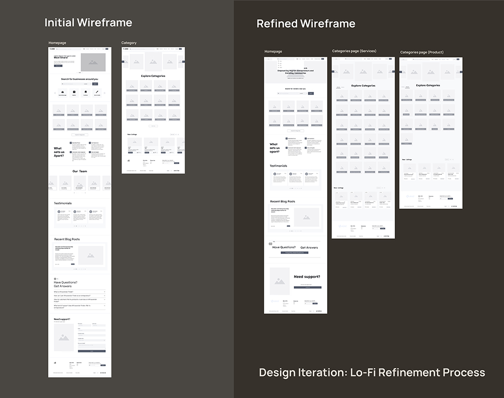
Screenshot of wireframe Before and After Usability Testing

The lo-fi wireframe were refined based on insights to improve usability and align the designs with user expectations.

Transition to High-Fidelity Designs

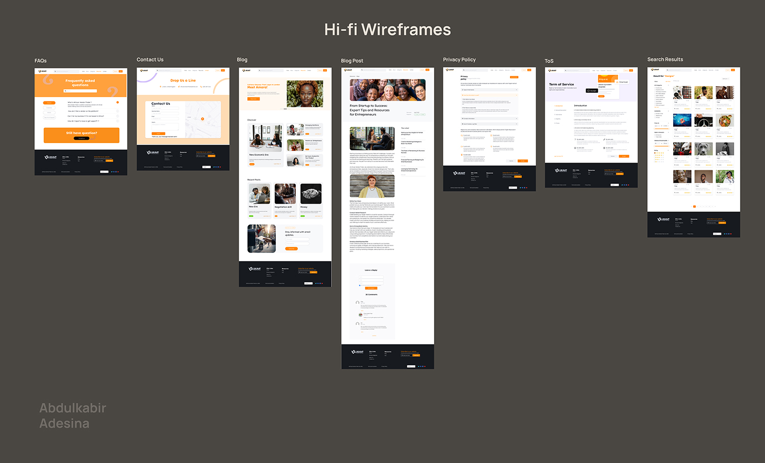
Based on the feedback gathered from usability testing, high-fidelity (hi-fi) designs were created to incorporate these improvements.

High Fidelity Design For UK Vendor Finder (streamlined Home and Category Page)
High Fidelity Design For UK Vendor Finder
High Fidelity Design For UK Vendor Finder (streamlined Home and Category Page)

Project Outcomes

Key Achievements

  • Simplified Onboarding: Reduced the steps and added clear guidance, resulting in a 30% increase in vendor registrations.
  • Enhanced Trust: Introduced verification badges, which led to improved vendor credibility.
  • Improved Usability: Redesigned the dashboard to include intuitive analytics, increasing engagement by 20%.

UK Vendor Finder high-fidelity Prototype
Scroll to Top